With the constant evolution of smart phones and mobile devices, users are expecting more efficient and intuitive functionality from mobile websites. This is especially true for those mobile sites designed for touch screen devices.
According to a 2009 whitepaper from Gomez, Inc., almost 75% of mobile web users expect to complete a simple transaction in a minute or less before giving up and exiting the site. This is due to a variety of reasons such as interruptions from everyday life, incoming phone calls, and changing network strength when on the move.
Customers are continually frustrated when attempting to make a purchase on a mobile website, especially when they invest a lot of time and energy researching to find the perfect item, only to struggle when going through the checkout process. Sometimes their frustration stems from a number of factors, and other times it is something as simple as not having a guest checkout option. So, how can mobile site managers make the customer experience of their mobile checkout process more intuitive and enjoyable? We conducted an internal study of mobile websites to find out.
We looked at the mobile websites for Amazon.com, BestBuy.com, Target.com, and BarnesandNoble.com with a focus on their Add to Cart and Checkout processes. Users were asked to search for and purchase a DVD of their choice on some of the most commonly used smartphones, such as the iPhone 3Gs/4G, Android (Droid X/Evo), and Blackberry Curve. From this study we have compiled what we consider to be some of the most important factors to consider when improving the checkout process on your mobile site.
- Provide an ‘Add to Cart’ option from the Search Results.
A Search feature is often paramount on mobile retail websites as several users prefer to search for products instead of clicking through various product-related pages. Also, the ability to add an item to the cart from the search results, instead of only the product page, saves users a click and an additional page load.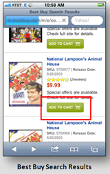
- Place a ‘Checkout’ button at the top of the screen, as well as at the bottom.
Placing a ‘Checkout’ button at the top of the screen expedites users’ ability to dive into the checkout process as it is easily accessible. Additionally, a button at the bottom of the screen saves users from having to scroll back to the top of the page to checkout if they have multiple items in their cart.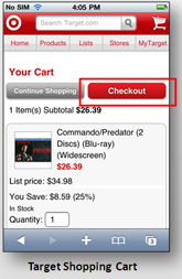
- Allow users the ability to checkout as a ‘Guest’.
Customers do not like being forced to register with the site in order to purchase an item. We have heard some customers say they would simply discontinue the transaction or drive to a store to find the same item, simply because they are being asked to register at the beginning of the checkout process. However, it is worth providing users with an option to create an account at the end of the transaction as they have already entered their information. If you offer users the option to create an account at the end of the process, ensure the benefits of registering are displayed.
- Provide a step/progress indicator throughout the entire checkout process.
This feature helps manage users’ expectations and lets them know where they are in the process. Customers like knowing where they are and how much further they have to go before completing their checkout process. Lack of communicating the progress may ultimately hurt conversion if users encounter issues during checkout.
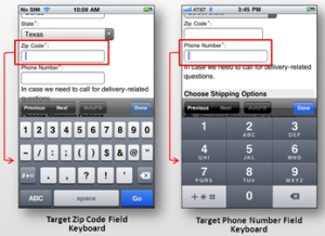
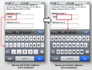
- Provide a field-sensitive on-screen keyboard.
When clicking in alpha-fields (i.e. First Name, Last Name), display an alpha keyboard. When clicking in numeric fields (i.e. Zip Code and Phone Number), display a numeric keyboard. Email fields should have <.com> and <@> keys. Also, in an address field, begin with a numeric keyboard for the street number and switch to an alpha keyboard after a space is entered to enter the street name. See the examples below:
- Default shipping address to billing address or vice-versa.
Regardless of which address information you ask your customers for first, ensure the same address is reflecting on the following step for shipping/billing. Also, ensure a method for editing the address or entering a new address is also present in cases where the billing and shipping addresses differ.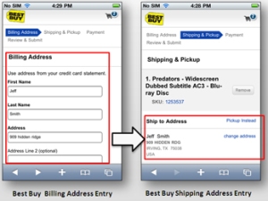
- Provide the shipping options on the shipping address page.
Consolidating these related steps into one page equals one less step in the overall checkout process, expediting the transaction time.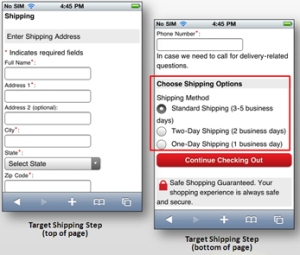
- Automatically save the cart contents.
On return to the mobile site, items added to the cart should persist, regardless of whether or not the user has signed in. If the user is signed in and items are added on the mobile site, allow items to carry over to the html website’s shopping cart, should the user choose to complete the transaction later from their home .
.
Implementing these best practices within the checkout process of your mobile website will help to ensure that customers have any easy and enjoyable purchasing experience.
Author: Tony Moreno, Usability Analyst
Contributors: Jeff Schueler, President & CEO
Jason Vasilas, Senior Usability Specialist
[…] mobile websites. This is especially true for those mobile sites designed for touch screen devices. Link – Trackbacks Posted in User experience (UX) | Permalink. ← 10 #Usability Secrets […]
[…] mobile websites. This is especially true for those mobile sites designed for touch screen devices. Link – Trackbacks Posted in User experience (UX) | Permalink. ← RT @Alconis: How people […]
[…] mobile websites. This is especially true for those mobile sites designed for touch screen devices. Link – Trackbacks Posted in User experience (UX) | Permalink. ← PHP Advent 2011 / Code […]
[…] mobile websites. This is especially true for those mobile sites designed for touch screen devices. Link – Trackbacks Posted in User experience (UX) | Permalink. ← Nokia’s view on mobile […]