Trust Is the New Black (of brand metrics)

How does your brand measure the health of your relationship with your customers? If you answered: “Satisfaction,” then you are not keeping up with the latest in metrics fashion. Trust is the new black of brand metrics, and here’s why.

Digital thought leaders are calling the times in which we live the Relationship Era of marketing. They reference the need for Trust Agent networks. They insist that brands must now communicate touchpoint by touchpoint, on a personalized, one-to-one basis, building trust with every encounter.

This is valid. This is not, however, new — at least to the world outside of marketing.

Building relationships the good old-fashioned way

As marketing continues the transition from mass, single message communication into the realm of customer-by-customer relationship-building, it is effectively embracing the discipline known in pre-digital times as Selling. Effective selling has always been about forging enduring, loyal relationships. Effective selling relies on relationship-building principles established long before the advent of digital life.

At its heart, relationship-building is no more than doing the right thing by people. When you behave that way over time, people grow to trust you. When they trust you, they come back to you and continue to give you their business. You have proven (especially on occasions when you have done the right thing counter to your own interests) that you are — among other things — honest, fair, respectful, punctual, responsive, diligent, and responsible. What you have been is the best indicator of what you likely will be. You have earned trust. You will enjoy the rewards trust brings.

If brands are to adopt relationship-building as their digital marketing strategy, the brand itself must behave like a person – like a sales person working to earn the trust of a customer. The brand must deliver on its promises as diligently and consistently as the sales person (and the organization behind the sales person) must deliver on his or her promises.

The socially-engaged customer and viral consequences

Once the brand stops behaving in a manner that engenders trust and starts exhibiting behaviors that undermine trust, customers will become less loyal and more receptive to the enticements of competitors. When ( in this viral, digital age) a brand experience does not live up to a socially engaged customer’s expectations, that customer’s Facebook friends, Twitter followers, blog readers, and fellow chatters and forum attendees all get to know about it within seconds. That’s not exactly healthy for the brand. A bad experience is bad enough, but if the experience constitutes a betrayal, then the viral consequences for the brand can be dire, sometimes catastrophic. Ask Dominos or Taco Bell or Tiger or any other brand whose behavior has contravened everything its customers or fans have come to expect.

Nielsen’s Buzzmetrics division monitors social buzz (or The Conversation, as they call it) for major brands. Nielsen reports that the #1 “buzz” topics for consumer-serving brands (fast food companies, cable companies, car companies, for example) are actually the good old (pre-digital) issues – bathroom hygiene in fast food restaurants, customer service issues with cable or telephone companies, product defects for the car companies.

Nielsen advises its clients to make sure that they re-engineer their business processes in a way that allows them to take (especially) the negative feedback from the buzz and act on it. The brand needs to acknowledge the problem, thank the customer for bringing it to their attention, accept responsibility for it, fix it, communicate progress back to its customers, and make sure it doesn’t happen again. Just like a real person must do when they want to salvage or repair any regular personal relationship in which they have mishandled.

Why trust is the new black

Relationships can survive isolated instances where the one party fails to deliver on its promises. Brands cannot expect to sustain relationships with their customers, however, if they fail to correct problems and see news of that failure broadcast across the social media landscape from a growing cadre of “betrayed” customers.

And the new millennium has already seen a parade of betrayals by business, especially and most recently by iconic brands from Wall Street. The Edelman Trust Barometer, which measures the public’s trust in a variety of areas, is barely above the lowest point in the survey’s 10-year history. The US public’s trust in the business sector is lower than that of almost every national public surveyed. This is important because trust drives the kind of consumer/customer behavior businesses want to see (repeat purchase, recommendation, stock purchase) and distrust drives exactly what they don’t want (churn, negative recommendation, and stock dumping).

As brands embrace Relationship Building as their digital marketing strategy, therefore, they would be wise to study, embrace, and adapt the principles developed in the analog world of selling and behave like a real person. With that understanding, they can use trust as the metric by which they measure the health of their customer experience across every touchpoint. That is why Trust is the new Black.

–Roger Beynon, Chief Strategy Officer
Sizing Up the Competition, Getting the Most Out of Comparative Testing

A new year is upon us, and perhaps you’re thinking it’s time to size up the competition and dominate your space. At Usability Sciences, one of the services we offer is the Comparative Test. We use this methodology anytime our clients want to find out where they stand among the competition, and more importantly, formulate a strategy for their next move. This article explains methodology, how to get the most value out of it, and when it’s appropriate to use.

How it works and what you’ll get:

The Comparative Test typically places your website/product against two to three competitors. Test participants are asked to perform the same core tasks on each product. As they work through the products, they are asked to provide qualitative feedback as well as complete a variety of surveys, including satisfaction and preference surveys.

During this process, the following occurs – A) Users identify likes and dislikes of each product, and ultimately identify a preference and B) through observation, the analyst team uncovers strengths and weaknesses of each product. When these are coupled with one another, the analyst team is then able to create and recommend a Best-of-Breed model. In other words, if the best attributes from all competitors were merged into one product, the end result would be the best of breed.

This will equip your team with the knowledge to answer important questions such as “What new features and functions should we incorporate into our design?”, “What’s working well with our product and what needs improvement?”, and “What ideas can we borrow from our competition and what ideas should we avoid?”

What we recommend:

We recommend comparing three products during the study (ideally, your product and two competitor products). This allows participants to spend a reasonable amount of time on each product and get a feel for how the products differ from one another. Occasionally, clients want to compare a greater number of products. This can be done, but the richness of insight into any given product may be compromised. Basically, more time spent per product equates to a deeper user experience and thus, a more meaningful comparison.

We’ll work with you to create tasks that expose users to the products’ core features and functions. The goal is to ensure an apples-to-apples experience so that users can make valid comparisons. And don’t worry; if the products have unique features, we have ways to incorporate them into the study as well.

Typically, we recommend recruiting around 12 users in a study of this nature. Trends will begin to emerge between users 4-8, allowing results to comfortably solidify between users 8-12.

What you won’t get:

A common misconception is that a Comparative Test will yield recommendations to resolve usability issues. These typically won’t surface in this type of methodology due to the fact that users are not afforded the amount of time needed to truly explore trouble spots and provide in-depth suggestions. More importantly, moderator questioning is limited so as to avoid artificially amplifying both positive and negative issues and coloring user impressions. Our moderators provide the playing field and the users are left to their own experience to draw conclusions.

You also won’t get metrics such as Time on Task, Success/Failure rates, etc. These metrics are derived in our more clinical and rigidly structured methodology known as the Competitive Test. That’s a topic for another discussion.

When it’s appropriate:

A Comparative Test is a valuable tool that can be used at a variety of different stages of a product’s life. If you have yet to design a website/product or have one in an early stage, this methodology can help identify what features and attributes are most valued by users. If you’re preparing a redesign for an existing website/product, the methodology can help steer you in the right direction, and more importantly, steer you away from bad decisions. And finally, if you have a mature product, the Comparative methodology is an excellent way to gauge where you stand against newer competitors and help identify enhancements and revisions for your own product.

Contact us to discuss how we might use this methodology to serve your needs and help put you ahead of your competition.

— Jason Vasilas, Senior User Experience Specialist

What’s In the Placement of a Consumer Survey? Everything.

Econsultancy recently posted a comprehensive review of best practices for e-commerce consumer surveys by Tim Leighton-Boyce.  It’s an excellent piece.  The writer is obviously a practitioner, since the advice reflects knowledge that can only have come the hard way.  One piece of that advice, however, is fundamentally flawed.  In the section “Where to place the survey”, Tim writes:

“Although there are great systems for allowing feedback surveys on every page of your site, I’m not in favour of using any form of pop-up which might distract your visitor from whatever they want to do.

Instead, my favourite type of e-commerce survey is one embedded in the order confirmation page. I like these because there is zero risk of distracting someone from placing an order since the survey is only offered once the sale is complete.”

Tim anticipates that this will raise objections, so he adds:

“The obvious objection is that this means you don’t get any survey entries from people who did not intend to buy or were unable to buy. That’s a common-sense point. But in reality it doesn’t seem to be a problem.

… In real life it turns out that people who have problems buying can be remarkably tenacious. Some will eventually find what they want, or make it through a tricky checkout, and then let you know all about the problems when they get to the survey comments form.”

It may, indeed, be a valid assumption that problems experienced by those who complete transactions are the same as the problems of those who abandon the site or fail to complete a transaction.  But how do you know for sure?  More importantly, how do you quantify the impact of those problems?  How do you measure the revenue loss they inflict?  How do you determine their root cause?  How do you set priorities in taking remedial action?

Failure data may be the most valuable kind you collect

As convenient as it may appear, surveying only those who emerge from the confirmation page necessarily skews the sample and presents a distorted picture of the user experience, especially the experience of visitors who fail.  Visit failure data may be the most valuable data a site can investigate because beneath that cumulative experience lie the root causes of conversion impediments.  Intercepting visitors at the start of their journey through your website ensures that you include those who fail as well as those who transact.  For most e-commerce sites, the proportion of those who do not purchase far exceeds those who do.  The process of identifying whom the site fails, where it fails them, and why it fails them offers the most direct route to continuous improvement.

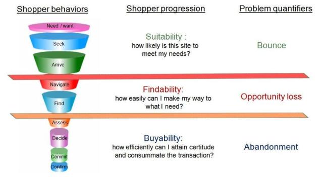
Behavioural and attitudinal feedback from hundreds of thousands of survey respondents over the last decade reveals patterns applicable to any e-commerce site.  This is what they look like:

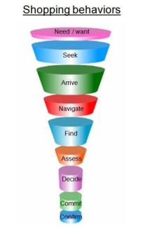
They start with some notional depiction of shopper behaviour – the sequence of thoughts or actions they evidence when shopping online.

These steps can be grouped into three basic user decision points:

Suitability – is this site likely to meet my needs?

Findability – how easily can I make my way to the product or information I seek?

Buyability – how easily can I reach certitude and then complete the transaction?

Visitors who fall out of the funnel at the site suitability level represent (in our classification) the problem of Bounce.

Visitors who fall out of the funnel at the findability level represent Opportunity Loss.

Visitors who fall out of the funnel at the buyability level represent the Abandonment problem.

These problems are what site owners must identify, quantify, analyze, and address if they are to systematically attack visit failure and its impact on conversion.  Sampling the visitor population only from those who successfully navigate their way through to the confirmation page makes this process inordinately difficult, if not impossible.

Continuous improvement is not just a tool; it is a philosophy and a strategy.  If a site is going to commit to a continuous improvement process, it should ask visitors to participate from the outset of their journey, so that it captures the full spectrum of site experiences and outcomes.  That’s where analysis starts and systematic improvement begins.

–Roger Beynon, CSO

Fundamental Best Practices of an Online Survey

Online surveys can be a valuable and effective part of your research efforts. Often used as a way to gather quantitative data, online surveys provide the means to gather participant demographics, opinions and ideas. These surveys are self-administered and provide an alternative to using a more structured, moderator-based methodology.

Last year, we conducted a Webinette that demonstrated some Do’s and Don’ts with creating online surveys. This year, we are providing similar guidelines (with more detail) in this month’s newsletter article.

  • Start with clearly understanding the research objectives.Specifically, you need to know how the data will be used and who will make use of the results. It’s also important to understand what action will be taken based on the results of each and every question. With this in mind, assemble a manageable group of well-qualified stakeholders to identify goals and contribute to survey content.
  • Keep your research objectives in mind when forming the questions. Your objectives should be your road map. If a question does not directly support a learning purpose, it should not be included. And, although your objectives will ideally govern the number of questions, avoid asking too many. Copious questions will cause participant fatigue and imminent bailout!
  • Use the right question type for the data you want to gather.There are several basic types of questions with varying reasons to use them. Some of the most popular:
    • Closed-ended question – This type of question has a predetermined set of answers from which the respondent can choose. The benefit of closed-ended questions is that they are easy to categorize and are often used in statistical analysis. The disadvantage is that they are more difficult than open-ended questions to write; they must include the question text and all the logical choices participants could give for each question.

      Two common types of closed-ended questions are:

      • Radio-button question – Where participants are asked to choose only one selection from a list of options.

      • Checkbox question – Where participants are asked to choose all selections that apply from a list of options.

    • Open-ended question – This type of question gives participants the opportunity to answer in their own words.

      Keep in mind that while responses to open-ended questions can be very valuable—and often even quotable—they can also yield vague responses that are difficult to interpret and categorize.

    • Rating-scale question – This type of question is often used in lieu of a flat yes/no, ‘agree/disagree’, or ‘not satisfied/satisfied’ question type. In other words, it enables participants to add nuance to their opinions.

      When creating a rating scale, it is recommended to order the rating choices from low to high, or left to right. Also, it is important not to use rating scale questions that people could have a difficult time interpreting and therefore answering appropriately. Ensure rating scale questions can be easily understood by participants by using the appropriate number of points on the scale (level of granularity). Additionally, label the points clearly, especially on longer scales.

      If the question does not support a high level of granularity, then use a smaller scale. Also, if you’ve used a specific scale in past research, you will want to use the same scale to be able to directly compare past data.

  • For radio button and checkbox questions, streamline the number of answer choices.
    For both radio-button and checkbox questions, avoid offering too many or too few choices. A good rule of thumb is to prepare a list of the most popular 6 to 10 choices with an “Other” and a “None of these” option. (It is a good idea to allow respondents to write in an open-ended response if they choose “Other.”)

    There are also occasions when it is appropriate to include a “Prefer not to answer” choice when content may be more personal in nature. The bottom line is NOT to leave your participants hanging with questions because they don’t have the knowledge or experience with the choices offered, or are just unsure how they want to answer.

  • Write simple, concise questions. 
    Don’t get long winded. Remember, the goal here is to not make your participants struggle so keep wording friendly and conversational. For example, let’s say you own a men’s clothing boutique and you want to know where your visitors shop for neckties. Do not use industry terms, or wording that you wouldn’t use in everyday conversation:

  • But, don’t compromise clarity.
    Here’s an example. If you are building a survey to find out about the effectiveness of website navigation, you may want to find out more about the search feature. If that is the case, you may be inclined to construct a question like this:

    But here’s where is begs clarity. Many will misconstrue the term “search”. Sure they “searched” for a product; they browsed around, navigated from one area to another in search of the right necktie. But, what you really want to know is how useful thekeyword search feature was.

  • Avoid two-faced questions. 
    Be sure your questions don’t need more than one answer. For example, if you are asking participants how often they shop for ties and belts, they may not be able to answer since they probably shop for one item more often than the other.

    Easy enough to correct but just be sure to include more than one question if there is more than one possible answer.

  • Avoid answer choice overlap. 
    Be sure choices don’t conflict with one another. This is a fairly common oversight, occurring more often than you might think. Look closely at the following question examples. Which one would you use in your survey?

  • Last, but certainly not least, DON’T fail to proof carefully.
    Spelling and grammatical errors present an unprofessional image so ensure you dedicate ample time and resources to proof and validate all content. A short checklist of online survey proofing procedures may help:

    1. Verify you’ve included the right questions to fulfill objectives
    2. Check for and eliminate question redundancy
    3. Always run a spell check
    4. Read the questions aloud when proofing
    5. Check logic for the appropriate actions
    6. If possible, ask someone who has not been involved in preparing the survey to take the survey

Considering these basic best practices when designing and constructing your online survey will facilitate good response rates and help ensure you don’t compromise data integrity.

Hillori Hager, Online User Experience Project Manager

What’s the Cost of Keeping Search Results Current and Relevant?

I’ve bought two dozen or more bottles of wine from the New York Times Wine Club over the past few years.  That would not qualify me as a highly valued customer, I’m sure, but it would likely rank me as worth retaining.

This morning I received an email ad from the wine club promoting a new Spanish wine.  Though I was not interested in the offer, the email did serve as a trigger to visit the site.  When I landed, I searched on pinot noir – the only grape I’m interested in these days — and here’s a picture of the results page.  It’s beautifully laid out but what a brand-eroding experience!

Of the 12 wines proffered, 10 are tagged Not Available.  I know that one of them, at least, hasn’t been available for a year.  The list would suggest, therefore, that the search pulls from historical product offerings rather than current product offerings.  That might be acceptable if the products are simply out of stock, but what if they are no longer offered?  Is it really that difficult to maintain a database?

The cost of providing current, relevant search results may be far less than the cost to the brand when it reflects so poorly on its diligence and processes.  How do you ensure that your search results reflect relevance AND currency?

–Roger Beynon, CSO

What’s In a Metric? Well, it Depends.

A client of ours has undertaken a Findability initiative.  A site’s “findability” determines the ease with which visitors can get from the page on which they arrive at the site to the page(s) containing the products or information they seek.

Funding for the project is conditional upon each phase proving its impact and value.  How to measure that impact, therefore, has become a focal point of debate and, naturally enough, contention.  Yes, we’re all familiar with the adage that numbers can make them say whatever we wish, but the complications go much further than that.  Over 50% of all failed visits to e-commerce websites happen because of findability issues.  Findability issues can encompass the site’s architecture and navigation scheme, its taxonomy, or its site search and meta-tagging strategy.  Whatever the reason, findability frequently impedes the visitor’s quest to find what they seek.  If they can’t find it, they can’t buy it.  So there’s a direct hit on conversion and revenue.

Assessing the effectiveness of the findability project should be a simple matter, should it not, of measuring conversion before and after?  Assuming nothing else has changed on the site, any difference can be reasonably ascribed to the findability initiative, right?  The problem lies in the assumption that nothing else changes, because that’s absurd.  In the online world everything changes at the speed of light.  Acquisition strategies are constantly being refined, resulting in dozens, possibly hundreds of different campaigns driving new and existing visitors to the site.  Landing pages are being tinkered with to optimize conversion.  Products are being added or subtracted.  Promotions descend with bewildering frequency at different times and within different categories or across categories.  A single review can launch or destroy a product. Items get moved into Sale or Clearance sections to make room for the next season’s inventory.  Pricing changes.  Recommendation engines place products in different contexts for different visitors.  A website never sleeps.  So the simple assumption that we undertake a findability initiative and compare pre/post conversion rates is, simply, not feasible.

We need to be nuanced in our approach to measurement and cognizant of matching the metrics to the measure.  Here’s what we mean.

Viewpoint

First, it’s essential to understand the viewpoint that a metric reflects.   Search success and search relevance, for example, should be metrics gathered from users through survey responses because the metrics reflect the viewpoint of the user.  The site’s metric for search success, however, often measures something completely different — the number of times the engine actually returns one or more results.  Similarly, the search function that ranks and scores results by “relevance” reflects the site’s definition of relevance, not the user’s.  Assigning the appropriate metric, therefore, depends on the viewpoint you wish to represent and what you  want to do with the data.  What are you measuring and what are you going to do with the results?

Thus, for the search aspects of the findability project, we might start by clarifying that we want to capture the user’s viewpoint of search success, because then we’ll know how effective it is from their point of view — which is what really matters.  One of our other clients followed the conventional way to measure search success – counting the number of times the engine produced one or more results.  Under that metric and from that viewpoint, it reported search success at 99.8%.  When they started asking visitors who used site search how successful their searches had been, the number fell slightly – 48%!  Be careful what you ask for!

Dimension

Beyond viewpoint, it’s important to distinguish between attitudinal and behavioral metrics.  We all know that what people say is often different from what they do.  During the redesign of the homepage of a national DIY site, the designers got positive reviews in usability testing of a shortcut button they added.  Subsequent path analysis demonstrated that the conversion rate of visitors clicking on the shortcut was 33% lower than that of visitors navigating through the left-hand menu.  Attitudinal data, in this instance, meant nothing in comparison to the behavioral data.  (The shortcut was never removed.  It had been the site manager’s idea.)

Relationship

The final step in metrics definition might be to explore the comparative value of direct versus indirect metrics.  Take a tree-test for site taxonomy.  You run a tree test on a single category.  Say, for argument’s sake, that 85% of users look in the correct categories for the products you ask them to find.  So you take the 15% of products that were not located and rework the taxonomy according to the feedback of where users thought the products belonged.  Then you rerun the test with the new taxonomy. Lo and behold, 94% of users find products this time.  You have a nine-point lift and a 10.6% improvement.  That’s a direct metric.  The cause-and-effect relationship between the taxonomy changes and findability scores are irrefutable.  The new taxonomy is better than the old.  But what happens if conversion falls when you introduce the new taxonomy to production?  Can you be sure that the cause-and-effect relationship is valid.  Because so many other factors contribute to conversion, the relationship between the taxonomy change and the lower conversion is indirect and therefore less reliable/trustworthy.  You have contradictory metrics.  What do you do?  Leave the new taxonomy in place or revert to the old?  You leave it in place.  Because direct metrics are indisputable and trump indirect metrics.  Whatever the cause of the conversion problem, the new taxonomy is certainly not it.

While you leave it in place, however, you should actually monitor a few other metrics.  The first is to look at the conversion of first-time visitors before and after the change.  This is as close to an apples-to-apples comparison of indirect metrics as you can get.  (You look at first-time visitors because visitors familiar with the site may or may not think the change is better, but it is different, and change can often provoke discomfort.)  The second is to look at site visitor survey data and compare the pre-/ post-change percentage of first-time visitors who cited Labeling issues as a reason for visit failure.

The take-away from all this metric-mashing?  Be clear about what you intend to do with the metrics.  Form follows function in metrics just as much as in architecture.  Balance the viewpoints, clarify the role of attitudinal and behavioral, assign direct and indirect appropriately.  Monitor and adjust.  You’ll be fine.

Mobile Phones, In-Store Shopping, and a Little Thing Called Certitude

Pew Internet released a report late in January 2012 that quantified a behavior we either exhibit ourselves or see others exhibit ever more often – people using their smart phones as part of the in-store shopping process.  During the holiday shopping season:

  • 38% of smart phone owners called a friend for advice
  • 25% looked up prices online
  • 24% looked up product reviews online

We all understand why people do this – it’s to feel confident that we’re making the right decision and getting the best price.  The word that best describes this state we seek is Certitude, defined as “freedom from doubt.”

Back in the day
Back in the day, reaching certitude in a store used to be difficult unless you had already been to several other stores to check out prices.  This is the way most of us learned to shop.  Reaching certitude took time and effort.  Then the Web introduced online shopping and we no longer physically had to scour the local retail landscape to compare prices and availability.  Comparison shopping was far more efficiently done through a browser.  Online certitude remained elusive, however, because we could not feel, smell, or get a true multi-sensory impression of the product we sought.  And online merchants often failed (and still do) to provide all the information we needed in order for each of us to reach our own points of certitude.

When we shop packing smart phones, however, we have found the fastest path to certitude.  The ability to access the Web while we’re mobile – via bar-code scanning apps and QR links, in particular — has effectively allowed us to be many places at the same time.  Add the social dimension into the mix, and we have the equivalent of certitude support that was previously provided by having a friend there to proffer their opinion.  Macy’s, Saks, and other retailers know their shoppers often send a photo from the fitting room, asking for feedback.

The implications of certitude for the online store
We each have our own pathways and our own levels of certitude, but the smart phone-equipped store shopper is likely to get there faster than the single-mode shopper.  And this realization begs a question for the managers of all e-commerce sites: Have you done everything you can to allow your visitors to reach their own level of certitude?

Answer that question first by looking at your internal search.  The fastest, surest way for a visitor to reach certitude online is by being able to type a product ID into the search box and have the results deliver exactly what’s being sought.  Take the case of jeans.  Females who like how a pair of jeans fits in the store will often go online later to buy more pairs in different colors.  They already know the jeans fit, they just need to see what other colors are available.  Simple, right?  No.  The product ID on a garment label may have nothing to do with the way the garment is referenced as online inventory.  The ID ascribed by the manufacturer may be different from that ascribed by the retailer.  Product descriptions themselves can and often do vary across channels.  Consistency in identification, therefore, is the first task in assuring findability via search and facilitating visitor certitude.

Once you’ve looked at search and meta-tagging, turn your attention to the browse path.  The “path to certitude” checklist depends on what’s being sold, but the typical pieces of information in a typical product-based site would include: features/benefits, demos/ videos, specs/dimensions, colors/ swatches, views/details, options/customization, comparisons, ratings/reviews.   If you haven’t provided information to address the certitude needs of every visitor, you have given many of them a reason to abandon your site.

But there is a back-up plan.  It’s called policy.  A site like Zappos realizes that the key element in shoe-buying is fit.  Zappos also knows that it is impossible to convey fit as part of the shopping experience, yet, fit is essential for a shopper to reach certitude in shoe buying.  So what does Zappos do?  Zappos eliminates all the risk involved in buying shoes that do not fit by offering free shipping and free returns – for a year!  Zappos’ success has proven that online shoppers do not have to reach certitude if the site’s policies shift the consequences of an erroneous decision from the shopper back to the site.

To take the issue of certitude full circle — which is to say, back to the store shopper armed with a smart phone – the site manager must also think of the mobile visitor’s need for certitude by optimizing his site for mobile access or, better still, creating a pure mobile site.

Takeaways
So, the takeaways for retail website managers are:

  • Check your products for consistency of identification and align your meta-tags appropriately.
  • Check that you have provided every piece of product information that any visitor type would need in order to reach certitude.
  • Review your policies to see if you have done all you reasonably (and logically) can to shorten the path to certitude by shifting the burden of risk onto your own shoulders.
  • Create a pure mobile experience to facilitate certitude for the mobile shopper, too.

–Todd Luckey, Senior Usability Analyst

–Roger Beynon, CSO

Online Research Company First Visit Checklist

Research which enables the improvement of website design, content and overall usability has proven  particularly valuable as the world’s  industries become more and more reliant on their websites  for financial success.

Online research surveys are an example of this type of research.  An invitation to participate in a survey is presented to a company’s website visitors.   The data produced by those who accept the invitation is especially valuable in that it comes direct from the company’s own customers or constituents.

Note: There are multiple avenues online to post questions to the site visitor; some are free or very inexpensive, and some, at the other end of the spectrum, are priced according to the value of their results. 

If your research initiatives include determining information such as:

  • customer satisfaction/dissatisfaction
  • visitor purpose when coming to the website
  • ease or difficulty of completing a multi-step transaction on the site
  • user suggestions for site improvement
  • customer expectations about what can be achieved on your website, etc.
  • likelihood of visitor to recommend the website to friends and colleagues
  • relative success or failure of each website visit,


you probably will want to contact a recognized expert in the field of online survey research.

You can speed the process along if you have the following questions answered before you meet with your online survey partner company.

1) Site traffic numbers (yearly averages, and daily unique visitors)

2) Point of contact for the survey building process in your company

3) How many stakeholders will need to be included in the process at your company

4) Target timeframes for launch of survey on the site,  length of data collection, and receipt of agreed upon deliverables.  Is there an event/deadline for when results of the survey need to be presented to company management?

5) Is your site entirely public, or are some parts secure?

6) How is a survey to be tested prior to launch on your site…do you have your own staging/testing environment, or is this handled for your company by an outside entity.  Can you supply the URL’s of the testing/staging environment?

7) Can you supply access to a ‘dummy’ or ‘test’ account (user name and password) for the research company for any ‘funnel’s such as online checkout process, travel reservations process, etc.

8) What sort of behavioral information do you wish to devise from the survey data collection?  Based on visiting some specific content on the site, on using a site tool, or site registration requirements?

9) Will you need  one final report, or more frequent interim reports/updates?

10) Can you supply look and feel information specific such as logo requirements, color ID numbers, fonts, etc

11) Is there a third party vendor who you will want to have access to certain parts of the data produced by your survey?  Are you ready to supply their requirements for merging the survey data with their reports to you?

12) Will there be privacy issues to be addressed with participants in the survey (is your company in the pharmaceutical arena, or some other industry where privacy issues are regulated by governmental agencies)?

13) Do you want your company employees to be blocked from the survey?

14) Is there a specific format you will need for the deliverables for the research (export of raw data collection, PowerPoint presentation, Tableau scorecards, etc.)?

If you arrive at your first meeting with your survey research partner with this information already prepared, you will be much more effective in moving the project along, and much closer to getting the data you want to enhance your company’s website!


–Pat Bentley, Project Manager, Online Experience Services

Four Seasons $18m Redesign Is Taking a Lot of Heat

Four Seasons recently launched a massive overhaul of their website(you can read the econsultancy.com piece here).  E-consultancy readers everywhere immediately chipped in their critiques of the effectiveness of the $18m expenditure. Needless to say, there was a lot of cynicism.  Not content to let everyone else have all the fun, we asked one of our usability professionals for his take on the new Four Seasons website redesign.

Our Take

While the new look of the Four Seasons site is certainly polished with large, high resolution images of exotic destinations, it’s hard to believe a polished look was all they got for $18 million dollars. Yet, after going through the reservation process and reviewing the site at a cursory level, it seems functionality and intuitiveness took a backseat to flashiness.

Homepage Functionality

Starting with the homepage, it seems bothersome that you can’t hover over an image in the carousel to pause it, much less click it to view more information or begin the reservation process for that destination. The images are lovely and certainly draw users in, but with no controls or functionality, an immediate opportunity for conversion is lost.  Furthermore, there are several images in the carousel rotation, yet it is nearly impossible to tell how many. If there is a destination/image of particular interest, there is no way to click back to it for further studying. People like pictures and the images used here are top notch, which is why they are a prime area for additional interactions.

Map Features

Although the map feature for the regional options is commendable, the small map pins make it difficult to differentiate which location is a ‘hotel’, ‘resort’, or ‘coming soon’ (terms based on the key). Upon mouse-over of a pin, they all look the same. A more intuitive interaction would be for the enlarged pin (upon mouse-over) to represent the key icons as opposed to the current functionality.

Reservation Process

A positive feature of the reservation process is that the carousel images update to display those relevant to my selected destination. Again, the use of high quality images is a plus! The fact that the images continue to rotate in the background when the calendar light box appears is somewhat of a distraction. It would have been better served to pause the carousel rotation to allow customers to focus on the task at hand – selecting his/her desired reservation dates.

Once reservation dates are selected, the customer is then taken to a clean, yet standard room type selection page. The expand/collapse functionality for each room type is clean, but could be overlooked, as the ‘+’ icon is subtle. Another feature that could easily go unnoticed is the calculator icon next to the rate per night. There is no hover or change of the cursor upon mouse-over, making it easy to miss.  Luckily there is a ‘Convert Currency’ drop-down at the top of the list, but it too may go unnoticed because it is not within the primary area of the user’s attention. The ‘See More Information & Photos’ feature is disappointing. For the amount of money spent to revamp the site, one would think there would be additional images for each room type, and perhaps a 360⁰ viewer…no such luck.

How Do I Get Home?

There is no ‘Home’ button or noticeable icon/breadcrumbs to return to the homepage for the main Four Seasons site once in the reservation process, which is also user-unfriendly. Making the user hunt for a way to return home or utilize the browser ‘Back’ buttons is never a good thing.

Wrap Up

Overall, it’s hard to believe that $18 million dollars was spent to spruce up the site. While the visuals are attractive, the functionality and user friendliness of the site leaves something to be desired. One can’t help but to ask, how did Four Seasons spend so much money to upgrade a site, yet miss such obvious opportunities to improve the user experience?

Comment below and let us know your opinion of the Four Seasons website redesign.

Tony Moreno, Senior Usability Analyst

Tough Economic Times Call for Greater Localization of Website Content

For at least a decade, global companies have pursued online regionalization policies with varying degrees of commitment and enthusiasm.  Radical contraction in the world economy has injected a far greater sense of urgency into that pursuit, however, as global players rush to create content in local languages and build a user experience relevant to local cultures.  So why is localized content so much more important in tough economic times?

As spending tightens, decision-making – for consumers and commercial buyers alike – becomes more cautious.  Decisions take longer.  Managers of budgets – household or corporate – operate from within a siege mentality, parting with their cash or utilizing their credit reluctantly and with extreme discretion.  No-one can afford to make a poor decision, so it takes longer for each buyer to reach their own point of Certitude – defined as “freedom from doubt,” the point at which they can actually pull the trigger.

Whatever their country, culture, or condition, buyers don’t buy until they reach their own particular point of Certitude.  As buyers move through the decision-making process, they are making the climb toward Certitude.  That climb is much more difficult if the steps require the decision maker to evaluate an offering in a language not his own or through an online experience foreign to his way of looking at the world.  Global companies understand this, hence their rush to deploy global platforms versatile enough to deliver localized content.

Rushing, of course, carries its own risks, because international projects require different success criteria from domestic projects, no matter how complex those domestic projects may be.  Time after time, we see clients launch international projects without any idea of the pitfalls that await them and the additional costs they incur by falling into those pits.  Here are just a few examples.

  1. Timelines – quite apart from the difficulties of scheduling review sessions with constituencies in time zones as far apart as New Zealand and Poland, US-based  project managers rarely build in sufficient time for their overseas stakeholders to review materials with their own stakeholders, who may also be scattered across time zones, countries, and languages.  Whatever review period you envision, double it.  Your in-country team will need all that extra time.
  2. Translations – even if you use an “approved” translation company, have them submit three sample translations from three separate translators for a language.  Give those samples to the in-country experts and have them chose which translator best reflects their preferences.  No two individuals understand nor therefore translate text in exactly the same way.  Let your in-country stakeholders select up-front their preferred style.  Otherwise, there’s a risk they’ll feel compelled to nit-pick your translators’ work to death.
  3. Coordination — Never rely on your in-country resources to furnish you with customer lists or set up customer interviews or focus groups.  It’s not their job; it’s incredibly time-consuming; and it’s often done poorly.  You’ll likely end up having to use a third-party, in-country recruiting firm, so spend the money up-front and reduce the cost of rework and rescheduling that will otherwise occur.
  4.  Communication – Annotate deliverables heavily.   – The international team will almost always have its own in-country or in-region stakeholders.  Those team members need to be able to explain the deliverables to these stakeholders and then answer their questions without your being there.  This is much easier for them if the visual deliverables are fully annotated or if written deliverables have simple English annotations
  5. Politics — Understand that from a usability perspective you don’t need to test the wire-frames (the container) across a dozen countries.  From a political perspective, however, you may well need to test across many countries.  So the best use of your dollars or yen or deutschmarks would be to test wire-frames in a smaller group of countries; then test the beta site (the content) in as many as possible.

If, however, you are contemplating a global site redesign project, you would be wise to start with a global survey of the user experience.  Many US-based global corporations deploy websites with a hybrid localization architecture – they provide content in the local language down to the product page level, then switch the user back to the US site for detailed specifications and, especially, for support. The US site, of course, provides content only in US English.

This language switch occurs because it is cost-prohibitive for companies to provide and maintain content in multiple languages.  They know the cost “savings” of deploying this architecture; they have no idea, however, of the opportunity loss they incur by doing so.  Visit success (or satisfaction or purchase intent or brand affinity) scores for visitors forced to make the “transition” from content provided in their local language to content (especially technical content) delivered only in English run consistently and dramatically lower than the scores of those who do not have to make the transition.  That differential negatively impacts “conversion.”  The cumulative effects undermine revenue and retention.

Companies like HP have made enormous strides in moving content localization deeper and deeper into their country sites.  You can bet there is a sound ROI for doing so.


Roger Beynon