What’s In the Placement of a Consumer Survey? Everything.

Econsultancy recently posted a comprehensive review of best practices for e-commerce consumer surveys by Tim Leighton-Boyce.  It’s an excellent piece.  The writer is obviously a practitioner, since the advice reflects knowledge that can only have come the hard way.  One piece of that advice, however, is fundamentally flawed.  In the section “Where to place the survey”, Tim writes:

“Although there are great systems for allowing feedback surveys on every page of your site, I’m not in favour of using any form of pop-up which might distract your visitor from whatever they want to do.

Instead, my favourite type of e-commerce survey is one embedded in the order confirmation page. I like these because there is zero risk of distracting someone from placing an order since the survey is only offered once the sale is complete.”

Tim anticipates that this will raise objections, so he adds:

“The obvious objection is that this means you don’t get any survey entries from people who did not intend to buy or were unable to buy. That’s a common-sense point. But in reality it doesn’t seem to be a problem.

… In real life it turns out that people who have problems buying can be remarkably tenacious. Some will eventually find what they want, or make it through a tricky checkout, and then let you know all about the problems when they get to the survey comments form.”

It may, indeed, be a valid assumption that problems experienced by those who complete transactions are the same as the problems of those who abandon the site or fail to complete a transaction.  But how do you know for sure?  More importantly, how do you quantify the impact of those problems?  How do you measure the revenue loss they inflict?  How do you determine their root cause?  How do you set priorities in taking remedial action?

Failure data may be the most valuable kind you collect

As convenient as it may appear, surveying only those who emerge from the confirmation page necessarily skews the sample and presents a distorted picture of the user experience, especially the experience of visitors who fail.  Visit failure data may be the most valuable data a site can investigate because beneath that cumulative experience lie the root causes of conversion impediments.  Intercepting visitors at the start of their journey through your website ensures that you include those who fail as well as those who transact.  For most e-commerce sites, the proportion of those who do not purchase far exceeds those who do.  The process of identifying whom the site fails, where it fails them, and why it fails them offers the most direct route to continuous improvement.

Behavioural and attitudinal feedback from hundreds of thousands of survey respondents over the last decade reveals patterns applicable to any e-commerce site.  This is what they look like:

They start with some notional depiction of shopper behaviour – the sequence of thoughts or actions they evidence when shopping online.
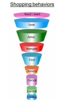
These steps can be grouped into three basic user decision points:

Suitability – is this site likely to meet my needs?

Findability – how easily can I make my way to the product or information I seek?

Buyability – how easily can I reach certitude and then complete the transaction?

Visitors who fall out of the funnel at the site suitability level represent (in our classification) the problem of Bounce.

Visitors who fall out of the funnel at the findability level represent Opportunity Loss.

Visitors who fall out of the funnel at the buyability level represent the Abandonment problem.
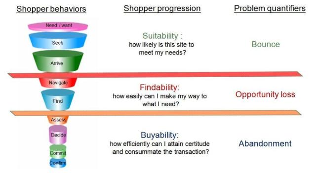
These problems are what site owners must identify, quantify, analyze, and address if they are to systematically attack visit failure and its impact on conversion.  Sampling the visitor population only from those who successfully navigate their way through to the confirmation page makes this process inordinately difficult, if not impossible.

Continuous improvement is not just a tool; it is a philosophy and a strategy.  If a site is going to commit to a continuous improvement process, it should ask visitors to participate from the outset of their journey, so that it captures the full spectrum of site experiences and outcomes.  That’s where analysis starts and systematic improvement begins.

–Roger Beynon, CSO

Fundamental Best Practices of an Online Survey

Online surveys can be a valuable and effective part of your research efforts. Often used as a way to gather quantitative data, online surveys provide the means to gather participant demographics, opinions and ideas. These surveys are self-administered and provide an alternative to using a more structured, moderator-based methodology.

Last year, we conducted a Webinette that demonstrated some Do’s and Don’ts with creating online surveys. This year, we are providing similar guidelines (with more detail) in this month’s newsletter article.

  • Start with clearly understanding the research objectives.Specifically, you need to know how the data will be used and who will make use of the results. It’s also important to understand what action will be taken based on the results of each and every question. With this in mind, assemble a manageable group of well-qualified stakeholders to identify goals and contribute to survey content.
  • Keep your research objectives in mind when forming the questions. Your objectives should be your road map. If a question does not directly support a learning purpose, it should not be included. And, although your objectives will ideally govern the number of questions, avoid asking too many. Copious questions will cause participant fatigue and imminent bailout!
  • Use the right question type for the data you want to gather.There are several basic types of questions with varying reasons to use them. Some of the most popular:
    • Closed-ended question – This type of question has a predetermined set of answers from which the respondent can choose. The benefit of closed-ended questions is that they are easy to categorize and are often used in statistical analysis. The disadvantage is that they are more difficult than open-ended questions to write; they must include the question text and all the logical choices participants could give for each question.

      Two common types of closed-ended questions are:

      • Radio-button question – Where participants are asked to choose only one selection from a list of options.

      • Checkbox question – Where participants are asked to choose all selections that apply from a list of options.

    • Open-ended question – This type of question gives participants the opportunity to answer in their own words.

      Keep in mind that while responses to open-ended questions can be very valuable—and often even quotable—they can also yield vague responses that are difficult to interpret and categorize.

    • Rating-scale question – This type of question is often used in lieu of a flat yes/no, ‘agree/disagree’, or ‘not satisfied/satisfied’ question type. In other words, it enables participants to add nuance to their opinions.

      When creating a rating scale, it is recommended to order the rating choices from low to high, or left to right. Also, it is important not to use rating scale questions that people could have a difficult time interpreting and therefore answering appropriately. Ensure rating scale questions can be easily understood by participants by using the appropriate number of points on the scale (level of granularity). Additionally, label the points clearly, especially on longer scales.

      If the question does not support a high level of granularity, then use a smaller scale. Also, if you’ve used a specific scale in past research, you will want to use the same scale to be able to directly compare past data.

  • For radio button and checkbox questions, streamline the number of answer choices.
    For both radio-button and checkbox questions, avoid offering too many or too few choices. A good rule of thumb is to prepare a list of the most popular 6 to 10 choices with an “Other” and a “None of these” option. (It is a good idea to allow respondents to write in an open-ended response if they choose “Other.”)

    There are also occasions when it is appropriate to include a “Prefer not to answer” choice when content may be more personal in nature. The bottom line is NOT to leave your participants hanging with questions because they don’t have the knowledge or experience with the choices offered, or are just unsure how they want to answer.

  • Write simple, concise questions. 
    Don’t get long winded. Remember, the goal here is to not make your participants struggle so keep wording friendly and conversational. For example, let’s say you own a men’s clothing boutique and you want to know where your visitors shop for neckties. Do not use industry terms, or wording that you wouldn’t use in everyday conversation:

  • But, don’t compromise clarity.
    Here’s an example. If you are building a survey to find out about the effectiveness of website navigation, you may want to find out more about the search feature. If that is the case, you may be inclined to construct a question like this:

    But here’s where is begs clarity. Many will misconstrue the term “search”. Sure they “searched” for a product; they browsed around, navigated from one area to another in search of the right necktie. But, what you really want to know is how useful thekeyword search feature was.

  • Avoid two-faced questions. 
    Be sure your questions don’t need more than one answer. For example, if you are asking participants how often they shop for ties and belts, they may not be able to answer since they probably shop for one item more often than the other.

    Easy enough to correct but just be sure to include more than one question if there is more than one possible answer.

  • Avoid answer choice overlap. 
    Be sure choices don’t conflict with one another. This is a fairly common oversight, occurring more often than you might think. Look closely at the following question examples. Which one would you use in your survey?

  • Last, but certainly not least, DON’T fail to proof carefully.
    Spelling and grammatical errors present an unprofessional image so ensure you dedicate ample time and resources to proof and validate all content. A short checklist of online survey proofing procedures may help:

    1. Verify you’ve included the right questions to fulfill objectives
    2. Check for and eliminate question redundancy
    3. Always run a spell check
    4. Read the questions aloud when proofing
    5. Check logic for the appropriate actions
    6. If possible, ask someone who has not been involved in preparing the survey to take the survey

Considering these basic best practices when designing and constructing your online survey will facilitate good response rates and help ensure you don’t compromise data integrity.

Hillori Hager, Online User Experience Project Manager

Online Research Company First Visit Checklist

Research which enables the improvement of website design, content and overall usability has proven  particularly valuable as the world’s  industries become more and more reliant on their websites  for financial success.

Online research surveys are an example of this type of research.  An invitation to participate in a survey is presented to a company’s website visitors.   The data produced by those who accept the invitation is especially valuable in that it comes direct from the company’s own customers or constituents.

Note: There are multiple avenues online to post questions to the site visitor; some are free or very inexpensive, and some, at the other end of the spectrum, are priced according to the value of their results. 

If your research initiatives include determining information such as:

  • customer satisfaction/dissatisfaction
  • visitor purpose when coming to the website
  • ease or difficulty of completing a multi-step transaction on the site
  • user suggestions for site improvement
  • customer expectations about what can be achieved on your website, etc.
  • likelihood of visitor to recommend the website to friends and colleagues
  • relative success or failure of each website visit,


you probably will want to contact a recognized expert in the field of online survey research.

You can speed the process along if you have the following questions answered before you meet with your online survey partner company.

1) Site traffic numbers (yearly averages, and daily unique visitors)

2) Point of contact for the survey building process in your company

3) How many stakeholders will need to be included in the process at your company

4) Target timeframes for launch of survey on the site,  length of data collection, and receipt of agreed upon deliverables.  Is there an event/deadline for when results of the survey need to be presented to company management?

5) Is your site entirely public, or are some parts secure?

6) How is a survey to be tested prior to launch on your site…do you have your own staging/testing environment, or is this handled for your company by an outside entity.  Can you supply the URL’s of the testing/staging environment?

7) Can you supply access to a ‘dummy’ or ‘test’ account (user name and password) for the research company for any ‘funnel’s such as online checkout process, travel reservations process, etc.

8) What sort of behavioral information do you wish to devise from the survey data collection?  Based on visiting some specific content on the site, on using a site tool, or site registration requirements?

9) Will you need  one final report, or more frequent interim reports/updates?

10) Can you supply look and feel information specific such as logo requirements, color ID numbers, fonts, etc

11) Is there a third party vendor who you will want to have access to certain parts of the data produced by your survey?  Are you ready to supply their requirements for merging the survey data with their reports to you?

12) Will there be privacy issues to be addressed with participants in the survey (is your company in the pharmaceutical arena, or some other industry where privacy issues are regulated by governmental agencies)?

13) Do you want your company employees to be blocked from the survey?

14) Is there a specific format you will need for the deliverables for the research (export of raw data collection, PowerPoint presentation, Tableau scorecards, etc.)?

If you arrive at your first meeting with your survey research partner with this information already prepared, you will be much more effective in moving the project along, and much closer to getting the data you want to enhance your company’s website!


–Pat Bentley, Project Manager, Online Experience Services

Listen To Your Website Visitors 24/7

A survey that offers continuous, real-time customer comments is a very valuable resource. 

Companies who deploy a site intercept survey on their website and collect survey data for an extended time find this affords them extensive opportunities to improve their site.

Rather than trying to understand what your site visitors want, need or expect from your site within the confines of a brief window of time, consider tracking their responses over a full year of data collection.

The benefits of such a program?

  • Allows you to determine if your online business site has seasonal aspects, and if so, when they occur. For ecommerce/retail sites this allows you to know around which holidays your site visits spike, and which ones are, in effect, duds. For travel/lodging sites you can see if your heaviest visit numbers come two months ahead of the summer vacation period, or at some other time. In both of these cases; you can plan online incentives, promotions and sales to match appropriate ‘seasons’.
  • Enhances a Continuous Improvement Process (CIP) of your website by offering visitor suggestions about your website on a daily basis. These small, individual suggestions from your own customers can be evaluated and, if appropriate, implemented very quickly to improve your website.
  • Enables you to present results to your marketing, sales and executive teams on a frequent basis in the form of ‘dashboards’. Interactive dashboards allow you to select a group of visitors who came to your site with a specific purpose and determine how successful they were in their visit. Perhaps more important, if your survey includes open text options, you can learn why in their own words certain visitors failed. It’s very empowering information!
  • Frees you from your calendar. You are not tied to a specific, limited time period like a few weeks to gather input on how to improve your site. You can have your data 24/7. You can schedule your IT team to assist in regular/frequent upgrades through the year.
  • Allows you to prioritize suggested ‘tweaks’ to your site. If you find that visitors are vociferous in their complaints about your login requirements, but complain not nearly as often about your checkout process, you can determine which improvement to place at the top of your ‘to do’ list.

Think of your site visitor’s comments and responses to your survey questions as raisins in a loaf of raisin bread. One slice of the bread will give you several raisins, yes, just as will a briefly presented online survey, but those raisins (and that particular survey) may not bring you all the information you need to make a business decision about your company website. It takes the entire loaf, and optimally an entire year of data collection to get the whole story…

How Many Respondents are Too Many in Online UX Research?

When planning studies for the usability lab, sooner or later, the question gets asked, “How many users to do we need to test?” Depending on the goals of the study, and whom you ask, you’ll get answers ranging from 5 to 30. Most experts agree that testing more than that is not the best use of your limited usability budget, since each additional test participant costs money to recruit, test, and compensate.

In the world of online user experience research, a similar question comes up: “How many respondents do we need to consider the survey complete?” In the online realm, additional survey respondents are expensive not so much in terms of money, but in terms of time. How long can you wait for more and more people to complete the survey?

How many responses you’ll need really depends on what you plan to do with the data. What are the main goals of the project? Do you intend to use the data to inform design decisions (e.g., for a site re-design effort) or do you intend to use the data as benchmarks/metrics and compare it to some other data set (e.g., data collected in previous rounds or future rounds of research)? Related to the overarching goals of the research project are the analyses you’d like to have done on the data. Are you interested in analyzing click-stream data or are you strictly interested in survey responses? Will you want to “slice and dice” the data numerous ways to see how different demographic groups respond or how certain survey responses relate to other survey responses?

If you desire complex analyses, analysis of click-stream data, or multiple cross-tabulations of the various survey questions, then we recommend a minimum of 3,000 responses. This number of responses makes allowances for the large amount of variation that we see in site visitor behavior and helps to prevent any particular sub-group of respondents (e.g., first-time visitors) from being too small for meaningful analysis.

If you know at the outset that you are not interested in analyzing click-stream data and that your desired analysis of the survey responses does not involve complex or multiple cross-tabs, then answering the question of “How many responses do I need?” really boils down to two different scenarios:

  1. You need to compare this data set to another data set (e.g., from past or future rounds of research). If you will eventually have more than one data set AND you want to answer questions such as, “Did success increase from Round 1 to Round 2?” then we’d recommend gathering as much data as time would allow. If you intend to compare the data across data sets OR if you just don’t know whether or not you’ll need to compare the data at some point in the future, then we usually recommend a minimum of 1000 responses. Gathering 1000 or more sessions for a survey gives you greater flexibility in terms of how you might use the data in the future. One thousand sessions provide a sufficiently narrow margin of error (± 2.6% at a 90% confidence level) that you can draw conclusions about apparent differences between the two data sets and trust that those conclusions are reliable.
  2. You primarily are running the survey for qualitative purposes (for example, in order to inform design decisions, gather verbatim feedback, discover usability issues, etc.). If you know that you are not going to need to make numerical comparisons between two data sets, then you can feel reasonably comfortable with fewer sessions. The fewer sessions you gather, the wider your margin of error becomes. For example, at 90% confidence, here’s how the margin of error looks for various sample sizes less than 1000:
Survey sample size response table

As you can see, with 400 survey responses, your margin of error is somewhere close to ±4%. You can also see from the table that the relationship between number of sessions and margin of error is not linear, and there is a point of diminishing returns. If your research goals fall in this second category, you need to consider how wide a margin of error you feel comfortable with and balance that with how long you have available to let the survey run.

So, just as with lab-based studies, the answer to “How many responses do we need?” varies depending on the goals of your study. In general, though, it should fall between a few hundred and a few thousand.

Is Your Site Meeting the Needs of Your Future Customers?

Did you know that over a quarter of your site visitors are probably first time visitors? Did you know that first time visitors are less successful than all other visitors to your site? Understanding who your first time visitors are, why they visited your site, and how successful they were during that first visit is critical in providing both a satisfying user experience and helping drive the future landscape of the site. Here are a couple of examples. When analyzing the results of almost 9,000 visitor sessions from one of our online retail customers, we found that 25 percent were first time visitors to the site. Furthermore, first time visitors had a lower success rate (41 percent) than all other visitors to the site (51 percent).

In looking at their purchase history, 84 percent of first time visitors indicated that they had made a purchase in the customer’s store. This clearly identifies these visitors as not only being current in-store customers but also as a key segment in the future of your online customer base. We also learned that 86 percent of the first time visitors indicated they were the primary shopper for their household.

Perhaps most surprising was that the core demographic of the first time visitor was predominantly 25-45 year-old females while the frequent site customers were males 35-54. The site was catering to the frequent customer but not paying enough attention to the first time visitors and their needs. These are all key metrics that need to be taken into consideration to ensure the growth of the site. The takeaway is that you should continue to understand your first time visitor population, including their basic needs when creating future designs and modifications to your site. They are your potential  future customers.

Is Your Site Conversion Meeting Your Set Targets?

The success of a website is multi-faceted.  On the lowest level, visitors who do not already know a site URL should still be able to get to the desired website through methodologies used to maximize site traffic, such as Search Engine Optimization (SEO) or Pay Per Click (PPC).  But then, upon arrival, visitors should find a compelling and usable website, thus ensuring a successful visit experience.   Hand in hand, these fundamentals are essential to achieving conversions.

The following chart represents dollars spent on online advertising in recent years, as well as future spending projections.

Obviously, companies will continue to spend dollars on Internet marketing and they will continue to use SEO or PPC to drive traffic to their website.  But is it possible to reduce online advertising expenditures and still enjoy similar revenue?

Yes, and a key lies in how effectively the traffic is converted after arriving to your site.  This is where usability analysis becomes vital.

When usability analysis steps in

An effective usability analysis can uncover the reasons visitors are leaving the site, why they are not purchasing and, in general, the problems they are encountering that keep them from converting.  Every additional conversion increases revenue, thereby improving ad expenditure ROI.

In a recent online user experience study conducted for an e-commerce website, it was revealed that 33% of visitors arrived at the site via search engine organic results.  This indicates a certain level of success with their Search Engine Optimization.  However, of those arriving via a search engine, 41% claimed their site visit was unsuccessful because navigation was difficult and/or organization was unclear.  In other words, they didn’t find the site all that usable.

So, although the site optimization effectively drove traffic to the site, the user experience fell short in converting visitors. For this particular client, visitors who failed with the intention of purchasing represented a significant revenue loss, approaching $150k per day.

Working together

Usability testing early in the website development cycle is most effective because it reduces development cost.  You can improve the user experience before your site is launched and have the confidence that you have delivered a quality product. But even if conducted later in the cycle, usability issues can be addressed and corrected for subsequent releases.

It is no secret that the cost per click continues to increase over time and money spent on SEO or PPC must be on-going to continue driving traffic to the site.  But, the effectiveness of recommendations made to improve the site based on the usability analysis is enjoyed year after year.  Ongoing usability analysis will only continue to improve the conversion percentage resulting in added revenue.

The marriage of SEO/PPC and usability analysis is not only a winning combination but a required blend for success in the Internet marketing arena.

Can You Quantify Your Site Redesign’s ROI?

In today’s economic environment, it is critical to achieve a return on investment (ROI) for any budget that is spent. In the online environment, where the landscape changes so quickly—either due to competitive challenges or the increasing savvy and changing needs of the online consumer—achieving a ROI can be especially challenging. But the need to spend money online to remain relevant and compelling is an ongoing push.

Brands may regularly find themselves needing to do a full site redesign, or a partial site refresh, as part of their online strategic marketing plan. However, any investment in a website should be justified against the bottom line, making it necessary to demonstrate the quantifiable impact of any changes that are made to the online property.

So, What Might You Do?

There is a multi-phased (Pre-test/Post-test) approach, primarily used to measure the impact that changes have on a site (such as a full or partial redesign). The current website is first researched to gather benchmarking measurements. Keep in mind that by conducting research against the current website, real-time usability feedback and site experience data can be leveraged to guide the site redesign effort itself. The site is then updated (fully or partially revamped) and the new website is tested again.

Case Study

In a project for a client in the office supply category, Usability Sciences utilized this research design with dramatic results. The client brand team was gearing up for a major site redesign. In advance of this effort, Usability Sciences collaborated with the brand team on a two-phased research project that would serve two functions: 1) provide qualitative feedback on the current website that would direct the brand on where to focus their redesign efforts, and 2) provide quantitative benchmark measures of the performance of the site on key business indicators such as online conversion, success with site visit, and ease of use.

Phase I of the project, the pre-test, ran for six months. An online survey was utilized that included website entry and website exit questions to determine visit purpose and visit success, with various other demographic and key performance questions. Usability Sciences then conducted an analysis with the resulting findings becoming instrumental in focusing efforts on improving overall navigation and the checkout process. Redesign efforts continued and the new site was released three months later.

The following month, Phase II of the research project was launched when the post-test began by fielding the exact same survey on the new site, collecting data for the next four months. Upon conclusion, Usability Sciences conducted a second analysis, this time with the intention of comparing pre-test responses to post-test.

  • Key Finding #1:The checkout process experienced a 28% increase in completed transactions. Changes to site checkout, such as shortening the number of steps in the process from start to finish, had a significant positive impact on the conversion rate for online transactions. By looking at checkout process data, we determined that the pre-test measure of successful completion of checkout was 25%, while the post-test measure of successful completion of checkout was 32%, an increase of 7 percentage points, or a 28% lift in productivity. By enabling visitors to more successfully navigate the checkout process, the transactional mission of the site is being met to a greater degree, and the redesigned site delivers online conversion at a quantifiably higher rate.
  • Key Finding #2: Browsing navigation success was improved by 5%. Changes to site navigation, such as establishing a consistent page layout and implementing changes to the look and feel of the toolbar, had a significant positive impact on visitor browsing behaviors. By looking at visit experience data, we determined that the pre-test measure of the success rate of those seeking products using the browse path (as opposed to the search tool) was 79%, while the post-test measure of the success rate of those using the browse path was 83%, an increase of 4 percentage points, or a 5% lift in efficiency. By enabling visitors to more successfully match products to their needs, the organizational mission of the site is being met to a greater degree, and the redesigned site delivers a more powerful online branding experience at a quantifiably higher rate.

Parting Thoughts

In closing, as you face your own business needs of having to demonstrate return on investment with each of your online initiatives, a good rule of thumb to remember is that you can’t manage what you don’t measure. The Pre-test/Post-test methodology is an excellent tool to keep in your measurement toolbox for times when you are introducing a new online strategy (new look and feel, new messaging, usability enhancements) and you need to demonstrate the quantifiable impact of your approach.